How Pixel Art and Sprite Palettes Evolved Across Retro Consoles
A feature tracing how pixel art and sprite palettes evolved across retro consoles: from strict early limitations to expanded color chips, palette tricks and the emulation-era revival of chunky visual style.
Retro graphics look simple on the surface, but almost every iconic sprite sits inside tight hardware rules about color count, tile size, horizontal flip and on-screen object limits. Each console generation traded raw performance for memory, sprites per scanline and palette banks, and artists turned those constraints into recognizable visual languages: crisp outlines, dithered skies, parallax backgrounds and palette cycling. This feature traces the main palette and sprite milestones across NES and Game Boy generations, the 16-bit rivalry between Sega and Nintendo hardware, and the tools modern players use to study and preserve the results.
Early limits and the NES and Game Boy idioms
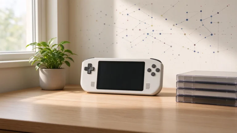
The NES video chip kept a small master palette, drew eight-by-eight pixel tiles, and restricted the colors available inside a tile block, so artists planned shading around attribute conflicts and used small selectable hues to give characters readable silhouettes on busy backgrounds. Sprite flicker appeared when too many objects shared a scanline, a tradeoff players learned to accept while platformers and action titles kept characters bold and dark-outlined. The original Game Boy pushed pixel art into a four-shade gray scale, where value rather than hue carried contrast; green-tinted monochrome palettes taught artists to rely on outline weight, tiered shading and distinctive proportions, which carried over to the later color handheld. The portable lineage discussed in the history of handheld gaming feature shows how compact displays forced art direction that emphasized readability at small size.
16-bit expansion: SNES color, Mode 7 and Genesis shading
The SNES lifted the color ceiling with a larger simultaneous-color palette, larger sprite shapes and multiple background layers, letting scenes stack hills, clouds, castles and foreground obstacles in parallax depth. Its advanced rotation mode warped a single background layer into pseudo-three-dimensional roads and map scenes, a trick that made racing and flight scenes feel dimensional on flat hardware. The Genesis relied on a structured palette, horizontal sprite processing and shadow-highlight effects that produced deeper blues, purples and metallic shading, while its tile engine supported fast action and strong neon palettes; shadow colors let fighters and vehicles read clearly on dark streets. Role-playing projects pushed detailed character portraits and animated spells, as the art in the Square title covered in the Chrono Trigger retrospective demonstrates through layered faces, town tiles and battle spell effects within the era’s tile budget.
Sprite budgets still mattered: maximum on-screen sprites per row, slow tile memory and limited animation frames meant artists reused poses, mirrored limbs, and expressed motion through wind flutters, projectile trails and enemy entry steps rather than high-fidelity movement. Cutscenes used the same tiles rearranged across multiple screens, so scene direction became another layered design skill.
Later handhelds and the emulation revival
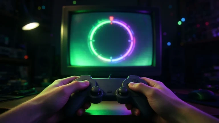
Color handhelds added multiple background palettes, richer sprites and sprite scaling, supporting animated portraits, varied enemy colors and detailed battle backgrounds while keeping the pixel language intact. On early DOS and Windows PCs, 256-color VGA palettes and mode-specific trick palettes created adventure games and shooters with gradients that could not fit a console tile system. The revival brought by emulators and indie development changed appreciation rather than the old hardware: artists now study palette usage, inspect scanline behavior, and run shaders that reproduce aperture-grille glow, scanlines and subtle blur. Pixelated styles in modern games deliberately borrow limited-palette logic, readable silhouettes and dithering patterns, even when rendering power removes the old memory constraints. Community tools, fan translations and restoration patches also preserve original sprite behavior, letting players compare a faithful palette run against upscaled or recolored presentations.
Why the design principles outlast the chips
Hardware limits forced a tight question: what must be recognizable at a glance, and which colors carry depth, danger and mood? Clear silhouette, shading value, restricted color counts and background separation remain useful practice even in digital art with unlimited pixels. Comparing these chips reveals that retro charm came from disciplined choices, not from low resolution by accident, and that a small palette used with restraint still communicates action, place and character far more memorably than oversized detail buried in a noisy screen.